An Evaluative Usability Analysis on Bailey's Health Center Appointment Scheduling Service
- Hannah Wagner
- Dec 12, 2025
- 25 min read
Overview
This evaluative usability analysis examines Bailey’s Health Center Appointment Scheduling Service with the goal of identifying opportunities to enhance efficiency and accessibility for students. The analysis employs a multi-method approach to assess the current scheduling process in place, including a hierarchical task analysis, literature search, heuristic checklist evaluation, written analysis, the development of three representative user personas, competitor analysis, Wizard-of-Oz prototype, a think-aloud interview and post-interview survey process, and a task load index (NASA-TLX) assessment to measure subjective workload. Additionally, the storyboard illustrates a typical user journey, while the competitor analysis and literature review provide contextual insights into best practices for appointment scheduling systems. We hypothesized that an online appointment booking platform would be more efficient and effective than the current methods of calling or booking in person. We used our research to inform the creation of our Wizard-of-Oz prototype. We aimed to create a simple and straightforward website interface for appointment booking with the goal of minimizing participant (n = 5) confusion or difficulty. Data collection methods include a think-aloud interview analysis and a user survey to capture firsthand experiences and perceptions of our formulated recommendation. We gathered qualitative data and feedback on our prototype from the transcribed think-aloud interviews and the follow up survey regarding points of confusion, suggestions for improvement, and elements they thought worked well. Additionally, quantitative data from the NASA-TLX assessment gave further insight into the breakdown of the mental or physical amount of effort required to successfully perform the task of booking an appointment. Based on these findings, a comprehensive list of strengths and weaknesses is generated to inform actionable recommendations. The ultimate objective is to propose an improved scheduling system that is more intuitive, efficient, and accessible, enabling students to independently manage appointments with greater ease.
Goals
Our client, Bailey’s Health Center, wants to begin designing an interface where Lafayette College students can easily book appointments online. Our first goal was to conduct background research on the effectiveness of the current appointment booking system. Before designing a system, we wanted to consult existing literature to support our hypothesis that an online booking platform would make scheduling appointments more efficient than the current methods (Kachooei et al., 2023). We also looked into design recommendations for online booking services before beginning our prototype (Luxenberg et al., 2022). Our goal while designing our Wizard-of-Oz prototype was to reduce elements that increase visual, cognitive, or physical workload to optimize ease of use. With the qualitative and quantitative data collected, our goal is to make more informed design recommendations for Bailey’s Health Center. Our assumptions of our analysis is that ‘lower is better’ in terms of overall NASA-TLX workload scoring, and that minimal hesitation or confusion from our Wizard-of-Oz participants is best. We also assumed that our Wizard-of-Oz prototype resembled the behavior of a real website interface enough to accurately represent the process of booking an online appointment.
Hierarchical Task Analysis
and Functional Allocation
We first conducted a hierarchical task analysis to analyze all tasks and subtasks when it comes to the current appointment booking system that Bailey’s Health Center uses. A hierarchical task analysis is done by breaking down all the specific steps it takes to accomplish a task as a way to identify the areas of improvement of the design (Annett, 2005). After proper decomposition of the task into smaller parts, you then put these actions into a diagram that helps clearly represent the different parts to accomplish the task. Noticeable on the diagram will be three letters: A, C and P. These stand for “Action,” “Cognition,” and “Perception,” indicating what can and cannot be directly observed in the task. Action relates to movements the user has to perform, cognition relates to decisions the user has to take and perception relates to the user’s senses, what they can observe or hear, as an example.
Figure 1: Hierarchical Task Analysis (HTA) of Current Appt. Booking Process with BHC

Functional Allocation
In Figure 1, a hierarchical task of analysis of the process of booking an appointment with the Bailey Health Center was done. A functional allocation allows us to determine the steps needed to complete a task that are done by a human, which are done using a machine, and which are done using both. Ultimately, it allows us to consider the strengths and weaknesses of using a person or a machine to do a task. For step 1 in Figure 1, finding the Bailey Health Center’s number, all subtasks are shared, human controls (H-C). In order to find that number, an individual has to use a device that has connection to the internet. The human controls what they physically type into the search engine on their device and decides where to click to find that phone number.
As for step 2 from Figure 1, those subtasks are also shared and the human controls (H-C). In this instance, the machine used is a cellular device. When the individual calls Bailey’s Health Center, they either interact with a machine, the answering machine, or talk to another person. Either way, they speak through a machine, the telephone, but the individuals are the ones dictating how long the call is and what is being said and done.
This hierarchical task analysis and functional allocation show that Bailey Health Center’s booking appointment does do what it is supposed to do, which is let students make medical appointments. It could, however, be a lot more efficient and require less overall tasks and subtasks. There is a chance when someone calls that no one is going to pick up the phone. When that happens, especially if it is urgent, students are left with no other option but to wait for a call back which can be frustrating. A feasible recommendation to make this process easier and more efficient would be to use automation. As will be described below, using an electronic booking system is recommended to make it quicker and easier for both parties to book appointments.
Heuristic Checklist Evaluation for Current System (Nielsen, 2024)
Visibility of Status (Yes/No)
This criterion relates to a system’s ability to keep users informed of what is happening through appropriate feedback. This is not completely met by the Bailey Health Center’s appointment booking system. When a staff member does answer, the worker asks questions in order to determine what the appointment is for and when is the best time to book the appointment. They will ask clarifying questions as well if they need more information. However, if a staff member does not answer the phone, the voicemail will direct callers to leave a message with the information they need and to wait for a callback. The issue here is that if they do not answer, there is no information about when the callback will happen. The user has no idea about their status and if they are a priority or not.
Match Between System and Real World (No)
This criterion relates to a system being familiar to users. For an appointment booking system, this means users should go through a process similar to booking for other health related services. The set of questions being asked by the Bailey Health Center’s employee who picks up the phone is similar to what other providers would ask (i.e, user’s reason for scheduling an appointment as well as their availability). However, a lot of providers, if not most of them, nowadays will use electronic booking systems in order to make the process easier and more efficient which is not the case therefore this heuristic is not met.
User Control and Freedom (No)
For this criterion, users should have a clear ability to correct mistakes. This process does not allow users to correct themselves unless they call back and correct their mistake if, for example, they said they were available at a time that they are actually not available. This criterion is not met because the current process makes it difficult to control their appointment details without seeking the help of a staff member. Therefore, users have less freedom because they are dependent on a staff member to make those adjustments.
Consistency and Standards (Yes/No)
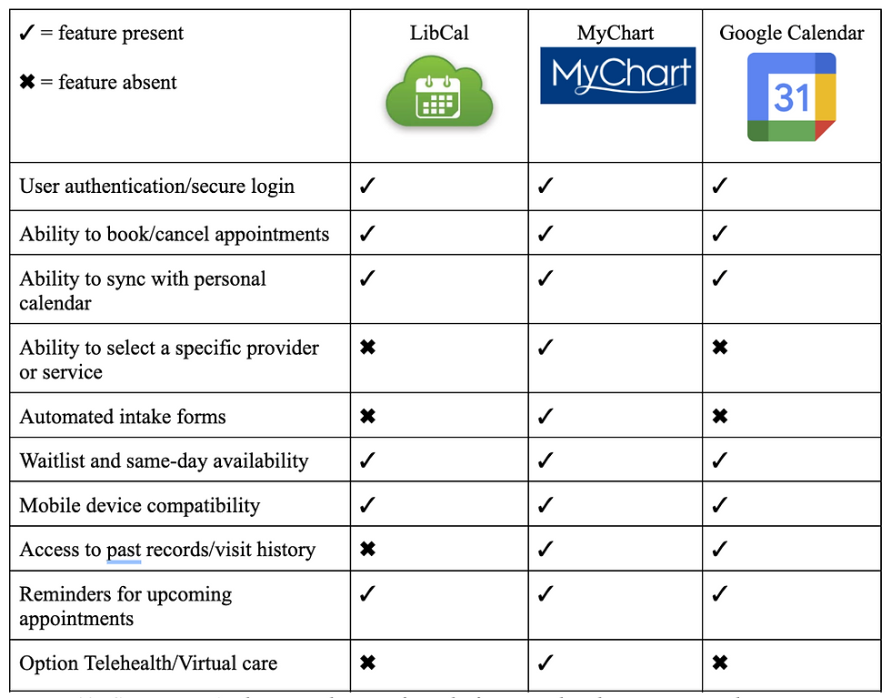
This guideline is about ensuring users do not struggle to understand how a system works since it should follow similar systems’ design. Similarly to what is mentioned above, the set of questions Bailey’s employee asks the user is similar to what other healthcare professionals would ask when one looks to book an appointment. Since someone walks the user through the steps on the phone, this system is easy to understand and easy to work with. However, Bailey’s employees are not given a consistent set of questions/prompts to instruct callers, so there will be individual differences that are inconsistent between calls. Additionally, many competitors and similar services have integrated online booking systems as seen in Figure 10, so Bailey’s differs from other service providers in that way. Therefore, this heuristic is partially met.
Error Prevention (No)
This heuristic is about ensuring systems have measures put in place to prevent mistakes from happening. When calling to make an appointment, the Bailey Health Center employee does repeat the information back that the user provides such as the reason for the appointment and the day and time of the appointment to prevent mistakes. However, verbal confirmation can often be unreliable and prone to miscommunication. Additionally, after hanging up the phone, users do not receive any form of written confirmation or communication from the health center regarding the date and time of their appointment, so they are responsible for keeping track of this on their own. If a miscommunication or scheduling error did occur, the user might not find out until it is too late to change or cancel and increases the risk of no-shows. This can create longer delays in access to treatment and is also unproductive for the health center. Furthermore, compared to other systems that have multiple confirmation checkpoints throughout the booking process, verbal communication might be the least effective way to ensure errors do not happen.
Recognition, Not Recall (Yes/No)
This heuristic is about reducing how much users have to remember actions related to systems. The information needed to use a system should be clear or easily retrievable. This heuristic is met since users are prompted by the staff member, and are not required to recall instructions when booking an appointment. The employee walks the user through the whole process. However, since there is no follow up appointment confirmation, users are required to recall their appointment time/date which does violate this heuristic.
Flexibility and Efficiency of Use (No)
This heuristic is about expert users being able to use shortcuts. This heuristic is not met since there is no way for frequent patients to book an appointment faster or more efficiently. All users have to rely on staff availability and answer the same questions each time they call regardless of how familiar they are with the system. There is also no way to customize or personalize the user experience or create shortcuts.
Aesthetic and Minimalist Design (Yes/No)
A system should not have an overload of information or unnecessary information. This criterion is partially met since the current booking process is fairly minimal and only collects essential information such as the reason for the visit and availability. If an individual is able to get in contact with someone over the phone, then the booking process takes 2-3 minutes. However, if a call is missed, this elongates the time to complete the task and complicates the booking process. There are no aesthetics related to this current system.
Recovery from Errors (No)
For this heuristic, systems should clearly state where there is an error, when that happens, and how to fix it. The employee on the phone will only state when there is an error when one happens on their end. If the error happens from the user’s side, then the system will not identify it. This current system requires users to recognize errors by themselves when they have made a mistake, and there is no provided feedback or error message in place to instruct the users of next steps. As stated for the 3rd heuristic, users can attempt to fix errors and recover by calling back, however this is a lengthy and complicated process and requires significant effort. This heuristic is therefore not met because the system cannot detect or communicate errors made by the user.
Help and Documentation (No)
Systems should have a way to direct users to steps explaining how to use said system and help them out. This criterion is not met since there is no way for users to know what the booking process entails. The only way for users to know they need to call in order to be able to book an appointment is by asking others since there is no mention of this online. This process relies solely on verbal communication which opens up opportunities for error and miscommunication.
Written Analysis & Ethical Concerns:
Our evaluative usability analysis examines the Bailey’s Health Center’s current scheduling service, which is calling the main telephone number found via a Google search. There are many ethical considerations that are highlighted within this process. First, autonomy is violated as the current system takes away students' ability to modify times and reschedule appointments leading to an increased amount of no-shows. The number of no-shows could be decreased with the implementation of personal agency instead of relying on a staff member to pick up the phone and edit the appointment for the user. Lastly, phone-based scheduling systems can invade the right to privacy and confidentiality for patients at the Bailey Health Center. This ethical concern can be violated if calls are overheard by other staff members or other students sitting in the waiting room. It also limits the access permissions and privacy standards that HIPAA ensures to each client as the client does have access to the forms that are being filled out for them, or what data is being collected on their behalf. Rather, this method relies on verbal consent where an individual might not have a complete understanding of what they are agreeing to. Considering these violations of ethics, our new system preserves accessibility, trust, and autonomy. Our design will encompass the option to input a generalized or open ended reason for the potential visit. This allows the patient to elect what information will be shared and with whom. This also aids with accessibility because automating the task ensures a more timely response to potentially urgent matters. Patients might also have increased trust that the task was successfully completed upon seeing a confirmation page and receiving a confirmation email.
User Personas
To better envision our target demographic and their needs, we formulated three user personas to describe possible users of the system and the circumstances in which they would need to interact with our appointment scheduling interface.
Figure 2: User Personas


Storyboard
Figure 3: User Storyboards, illustrations of the completion of a task utilizing our system design


Competitor Analysis
Figure 4: Competitor Analysis, similar interface platforms analyzed to compare and contrast the strengths, weaknesses, and features of each system.
Literature Search
In examining the aspects of scheduling that contribute to the patient experience and effectiveness, the research shows that adopting direct scheduling through online patient portals is effective for general medical examinations (Ganguli et al., 2020). Ganguli et al. (2020) use a longitudinal cross-sectional study to examine the characteristics of users associated with using online portal-based scheduling of medical visits. They found that the common users of online patient portals are younger, white, and commercially insured patients unlike the minority which are patients of color, older adults, and those with public insurance who are less likely to use portal-based scheduling (Ganguli et al., 2020). They were able to highlight the equity gap systemically placed with online portal-based scheduling services (Ganguli et al., 2020). This emphasizes the importance of equity and accessibility regardless of technological capabilities when designing digital scheduling systems (Ganguli et al., 2020). In another study Luxenburg et al. (2022) evaluated the journey experience from the need to see a community doctor to scheduling an appointment and attending. Using a telephone survey they found that timeliness and wanting to see a specific physician were the major considerations among participants (Luxenberg et al., 2022). This study contributed to the literature insight on how to design better scheduling services to fit patients’ needs (Luxenberg et al., 2022). Thirdly, Kachooei et al. (2023) experimented using a comparison approach to examine the amounts of scheduled surgeries and no-show rates between those who scheduled online and those who scheduled traditionally using the call method where staff schedule on behalf of the patient. They found that online systems can strengthen the effectiveness of traditional scheduling methods, which factors into creating a more efficient and patient controlled methodology towards scheduling (Kachooei et al., 2023). This study supports the literature in advocating for organizational efficiency and a reduction in administrative load (Kachooei et al., 2023).
To further advocate for workplace flow and optimal resource engagement, Yuk Lin et al. address scheduling allocation and the challenges within the workplace shift in their study. The workplace they focused on was an outpatient clinic, where their goal was to search for a better appointment schedule service and make a plan for the logistics of the system (Yuk Lin et al., 2017). Focusing on average wait time, resource overtime which include staff to working hours, and patient waiting area queue process, they wanted to minimize it all (Yuk Lin et al., 2017). Using a simulation model, they found that by manipulating the flexibility of resources and maintaining a limited number of staff and equipment, for example, the improvement statistics were about forty-three percent according to the combined performance index Z (Yuk Lin et al., 2017). Lastly, Habibi et al. (2019) focus on a clinic in Iran where they test out a scheduling system called OAS or online appointment scheduling system. They used a longitudinal design that spanned from April 2017 until December 2017, which helped measure pre-implementation versus post-implementation (Habibi et al., 2019). They found that between ten outpatient clinics (all with different specialities in practice) that the patient wait time dropped from 38 minutes to 23 minutes after implementing the online appointment scheduling system (Habibi et al., 2019). Along with this significant difference in wait times the no-show rates decreased by fourteen percent post- online appointment scheduling system (Habibi et al., 2019). This study contributes to the literature on the impact that booking tools have to increase user satisfaction and decrease waiting times and no-show appointments (Habibi et al., 2019).
Cognitive/Information Processing Demands
With Bailey Health Center’s current booking system, the main usability issue is the effort required to complete a task that could be done more efficiently. Good systems minimize cognitive and information processing demands by reducing the amount of attention, memory and mental efforts users need to expend (Luxenberg et al., 2022). Our redesigned system aimed to implement this by making the appointment booking process quicker and better aligned with users’ existing mental models. Our new design aims to implement a system that is consistent with other booking systems, which allows users to tap into their existing schemas about how appointments are typically made. This will work to reduce learning demands, provide information and feedback that supports users’ mental models, and allow users to navigate the system with minimal effort. Adding in multiple confirmation steps is an example of information that supports those models, helping users to form accurate schemas and reducing the chances of errors.
Memory and recall demands are further reduced by integrating the system with Google Calendar. Instead of relying on users to remember appointment details, to write them down or to wait for delayed confirmation, the system automatically creates a calendar event. This reduces the chances of forgetting by sending reminders and allowing users to easily retrieve forgotten appointment information. In contrast, Bailey’s current system increases the likelihood of forgetting because confirmation is not immediate and no built-in retrieval method exists.
Methodology
Participants
Seventeen Lafayette College students who are enrolled in Professor Nees’ Human Factors & Engineering Psychology Lab course participated in this usability study. All seventeen students completed the pre-experiment survey, which assessed the level of satisfaction with Bailey’s Health Center’s current scheduling system, frequency of appointment booking, and perceived difficulty of scheduling through the existing phone-based process. These participants were recruited through the psychology course and reflect the primary user population of the health center, as all were undergraduate students who routinely rely on Bailey’s medical care.
From this larger group, a subset of five students additionally participated in the think-aloud usability study using our Wizard-of-Oz prototype. These five participants were randomly selected volunteers from the original survey pool. They completed a standardized appointment-booking task while verbalizing their thoughts and decisions, which allowed for the observation of their real-time decision-making, points of confusion, and interaction. Since the goal of the think-aloud protocol was depth rather than representativeness, the small sample is appropriate for identifying usability concerns within our prototype. All participation was voluntary, no identifying information was collected, and students were permitted to withdraw at any time.
Materials
Prototype Interface
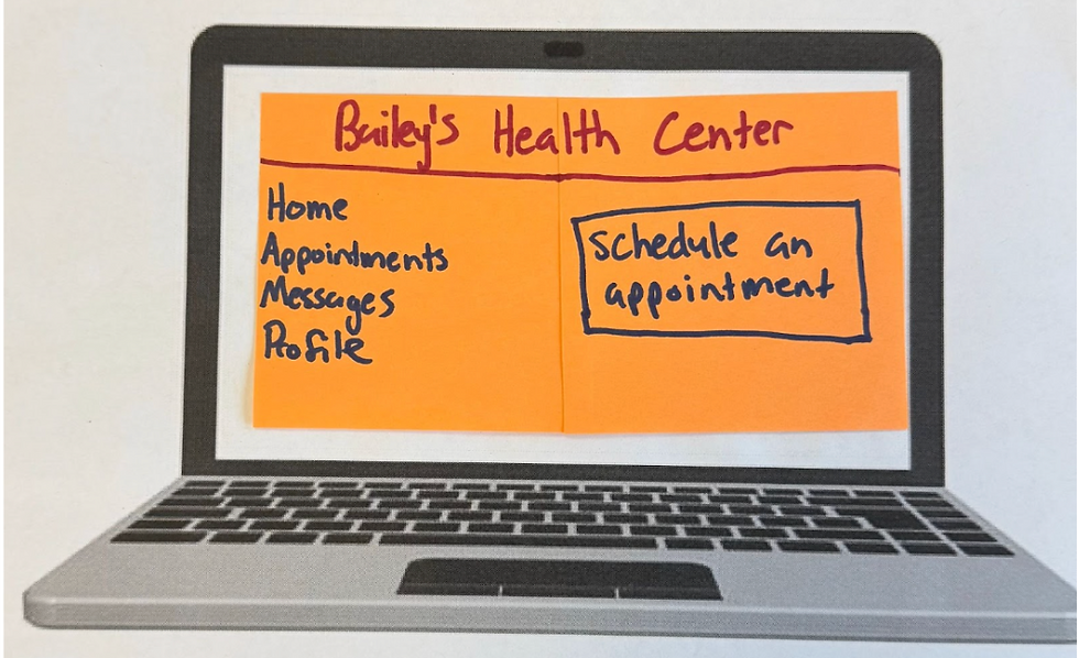
Figure 5: A display of the homepage of Bailey’s Health Center online scheduling portal. The interface includes a left-hand navigation menu with tabs for Home, Appointments, Messages, and Profile. The central button highlights a clearly marked “Schedule an Appointment” button, serving as the primary action for users. This layout supports intuitive navigation and reduces cognitive load for first-time users.
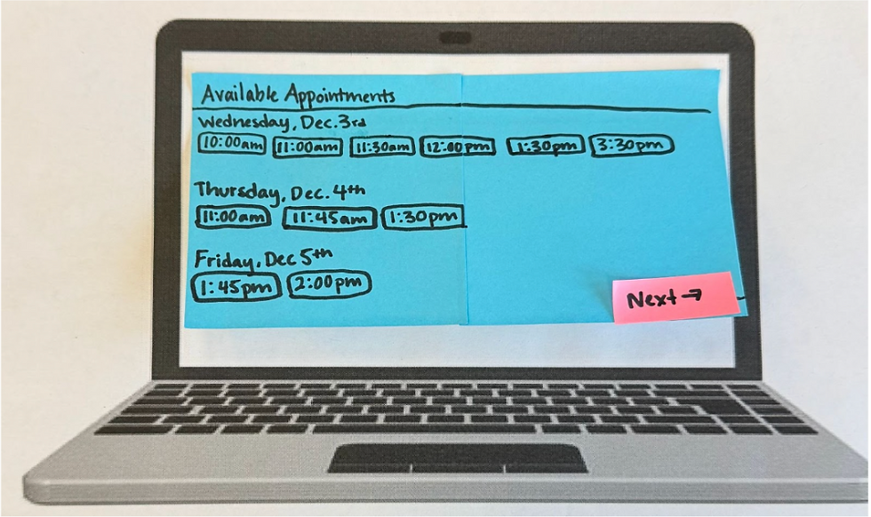
Figure 6: This figure illustrates the system’s display of available appointment slots across multiple days. Users can view all open times for Wednesday, Thursday, and Friday, allowing them to compare options and choose the time that best fits their schedule. The “Next” button advances the user to the next screen. This feature enhances transparency and efficiency by letting students select appointments independently.
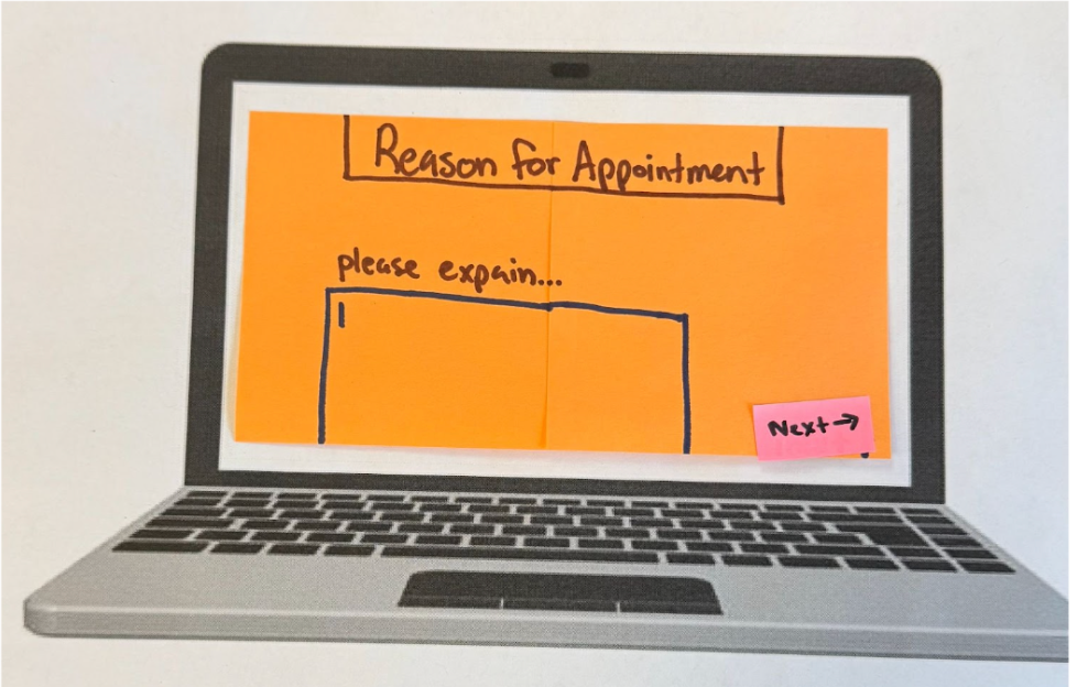
Figure 7: The screen where users enter the reason for their visit. The page presents a large text field prompting students to explain their symptoms or health concerns. The “Next” button is at the button right corner, guiding users forward in the booking process. This design increases user autonomy and ensures students can communicate concerns privately and in their own words, addressing one of the limitations of the current phone-based system.

Figure 8: A preview of the selected appointment before submission. Students can review the date and time of their upcoming visit and either confirm the appointment using the “Submit” button or make changes using the “Change” button. This review step aligns with usability heuristics for error prevention by giving users a chance to verify choices before finalizing.

Figure 9: Confirmation notification generated after the user clicks “Submit.” The system provides an email verification stating the date and time. This reduces uncertainty and addresses the lack of communication in the current scheduling process.

Figure 10: When the user opens the email, a page displays the confirmation interface, which offers users to add the appointment to their Google Calendar with a single click. The page also includes a prompt to notify a professor of illness, supporting academic accomodation. These features improve convenience, reduce no-show rates, and communication.
Think-Aloud Interview Script
Each of our participants (n = 5) were read the following script prior to beginning their appointment booking Wizard-of-Oz task:
“Today, we are going to ask you to use our Bailey’s Health Center website prototype to book an appointment. Pretend as if you are having cold-like symptoms (cough, runny nose, fatigue), and your task is to book an appointment at Bailey’s to get a COVID test with the online appointment booking service. You have class Monday - Friday from 8am-10:30am and 2:30pm-4:00pm. Find and book an appointment within the next 3 days that fits into your schedule. In the appointment details, include the symptoms you’ve been having. After you complete the booking, you will see a confirmation page. Once you have received a confirmation email notification, click on the notification. Then, the interview is complete. As you complete this task, you should speak all of your thoughts aloud. Tell us where you are clicking and typing on the webpage, what you are seeing on the webpage, and why you are making the choices you are making. Try to speak all of your thoughts out loud. We are evaluating this system and task instead of testing you. So please speak freely and describe your thoughts in as much detail as possible as you are completing the task. Do you have any questions? You may begin when you are ready.”
Surveys
Class (n = 17) Survey: User survey link , Participant (n = 5) Survey link: Survey link
Devices
The usability study was conducted using a simple physical setup designed to support our Wizard-of-Oz prototype. Participants were seated in a chair facing a laptop that had a printed blank paper with the frame of a laptop, representing a blank screen. With each step of the task, we placed sticky notes onto the laptop screen to represent the various screens of the interface. This simulated navigation between pages. Participants interacted with the prototype using an "invisible" keyboard to mimic typing, tapping, or pointing with their finger to select buttons, replicating cursor clicks and touchscreen interactions. This minimal device set up allowed us to infer digital interaction while maintaining full control over screen transitions and task flow.
Procedure
First, seventeen students who were present in Professor Nees’ Human Factors & Engineering Psychology class completed the pre-experiment survey that assessed their satisfaction with Bailey’s Health Center’s current scheduling system, their typical method of making appointments, and perceived difficulty with accessing care. After completing the survey, a subset of five students participated in the think-aloud usability session using our Wizard-of-Oz prototype. Each participant was seated in front of a laptop displaying the printed paper blank laptop screen and was instructed to imagine they were experiencing symptoms and needed to book an appointment within the next three days. They were asked to speak all thoughts aloud as they navigated the prototype, verbalizing anything they found confusing, intuitive, or unexpected. As the participants interacted with the sticky-note interface, pretending to type on an "invisible" keyboard and tapping buttons with their finger to simulate clicking, an experimenter manually advanced the prototype screen to reflect the user’s actions. The task concluded once the participant opened the confirmation email. Afterward, participants completed a brief post-task survey, including a NASA-TLX workload assessment and survey questions about the usability of the prototype. Observational notes were recorded throughout the session to capture behavioral patterns, hesitations, and navigation issues.
Measures
Several measures were collected to evaluate both the current Bailey’s Health Center scheduling system and the usability of our prototype. The pre-experiment survey captured quantitative ratings of students’ satisfaction with the existing system, the difficulty of scheduling appointments, and the frequency with which students relied on the scheduling method. It also included open-ended responses that provided qualitative insight into students’ frustrations and perceived barriers to accessing care.
During the think-aloud sessions, observational notes documented participants’ verbalized thoughts, navigation patterns, hesitation, and errors as they interacted with the prototype. These qualitative observations allowed us to identify usability issues that might not emerge through survey data alone.
After completing the task, participants filled out a post-task survey that included usability questions and an opportunity for them to reflect on their experience using our prototype. They also completed the NASA Task Load Index (NASA-TLX) assessment, which measured perceived mental demand, effort, frustration, and overall workload associated with using the prototype.
These measures combined quantitative and qualitative measures provided a comprehensive understanding of user experience, system usability, and areas of design improvement.
Results
Before testing our experiment, we had a psychology class at Lafayette College (n= 17) complete a pre-experiment survey. In this survey we inquired about user satisfaction with Bailey Health Center, how often they schedule appointments, and difficulty of scheduling appointments based on current mediums (calling and in person) as well as time it takes to request an appointment. Figure 10 displays that the majority of respondents rated their satisfaction with Bailey’s scheduling system a range of 2 to 3 out of 5.

Figure 11: Satisfaction with Bailey’s Scheduling System

Figure 12: Previous Methods of Appointment Making:
Figure 12 displays the various mediums which participants have previously employed to make appointments. The majority, 82.4% of users, said they have previously made appointments through calling the center, and 47.1% of users said they have also used walking-in person to schedule appointments.
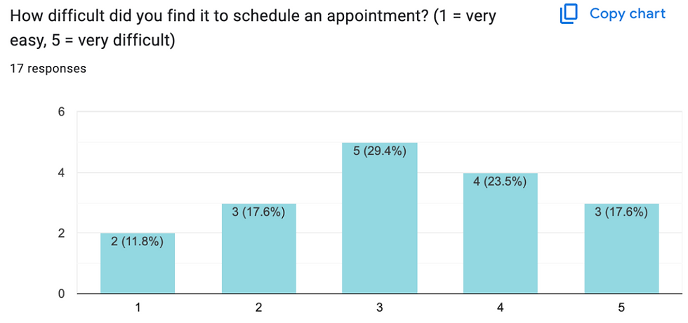
Figure 13: Difficulty Scheduling Past Appointments
Figure 12 displays the level of difficulty expressed by users. The majority, 29.4%, rated the difficulty level at 3 out of 5 and 23.5% rated the task a 4 out of 5. We then asked users to elaborate on their given number, where the majority expressed that the staff either do not pick up or the scheduling dates are so far out in advance that it no longer makes sense scheduling an appointment with Bailey Health Center. These findings support our initial hypothesis that the existing system is inefficient and can create difficulties for students when booking appointments.
Our subgroup of participants (n = 5) completed our Wizard-of-Oz interface prototype to complete the task of booking an appointment. Their interactions with the prototype allowed us to identify any points on our design that created confusion. We observed that the confirmation email in Figure 9 took the most time for participants to look at, likely because it required the most visual load out of all the screens. This observation can help us in updating our design in a way that minimizes visual load as much as possible.
The ‘think aloud’ element of the experiment also gave us more insight into participant’s thought processes as they completed the tasks. One participant expressed confusion about the “Reason for Appointment” page as seen in Figure 6 because they were unsure how much detail to provide. Future design could include more specific instructions on the type of information to input in that box. Another participant also expressed confusion about the function of the ‘email your professors’ feature embedded in the confirmation page. In a future design revision, more information about this feature can be added to avoid ambiguity. Another participant made a suggestion for a feature to include in revision, where instead of a type box appearing on this page, a drop down checklist of symptoms could expedite the process. We plan to consult the literature to determine if this is a strong design change to make in a future revision.
After the Think-Aloud and Wizard-of-Oz participants (N= 5) completed our experiment, they completed a post-experiment survey. Participants expressed through comments that our recommendations of a prototype for Bailey Health Centers scheduling system was easy to use and convenient as the Google Calendar option was automatically added to the participants schedule. One participant stated “I enjoyed the layout of the prototype, and the color-coding was helpful.” Another participant noted that our system was “easy to follow,” calling it “very convenient” in comparison to the old system. Overall qualitatively the comments were of high appraisal, the only suggestion a participant had was to include a review of the users responses, including their listed symptoms, at the end in addition to the scheduled time and date of their desired appointment.
Lastly, participants completed the NASA Task Load Index questionnaire to measure workload across perceived mental demand, effort, frustration, and overall workload associated with using the prototype. Figure 13 outlines each participant’s overall workload score.
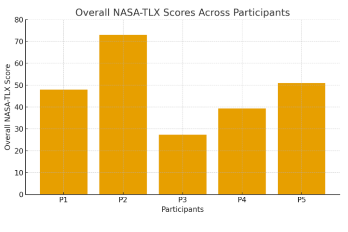
Figure 14: Overall Workload Score by Participant
While there was not a visible trend between each participants’ overall workload score, this still gave us meaningful insight into individual differences. With overall workload scores ranging from approximately 27 to 73, even while experiencing identical task demands, each participant experienced the cognitive load differently. These results are likely due to differences in experience, confidence, fatigue, etc that can impact scores between participants. Additionally, the variation is supported by the weighting of the different dimensions of workload demand. For example, P2 in Figure 13 experienced the highest overall workload, and accordingly had the high ratings for mental demand, performance, and effort. However, P3 had the lowest overall weighted scoring, and had low weighted ratings for performance and effort.
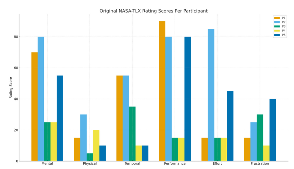
Figure 14: NASA-TLX Weighted Workload Dimensions Scores
Limitations
Firstly, the main critical limitation of this experiment stems from the limited number of participants used to test our Wizard of Oz prototype. Our small and unrepresentative sample size makes our results ungeneralizable and makes our data more susceptible to individual differences. Recruiting more participants and increasing our sample size would increase the amount of possible feedback as well as capture more representative data regarding the quality of our prototype. Secondly, our Wizard-of-Oz prototype was minimal, and our results relied on the assumption that it accurately represented an interface. In future research, we plan to create a fully digital prototype to more accurately resemble the interface. Thirdly, a limitation stems from the environment in which the experiment was conducted. The room in which participants interacted with the prototype was loud and filled with other experiments being conducted. Additionally, since our participants were also conducting experiments of their own in the same time frame, their attention and focus might have impacted since they had other tasks to complete. Similarly, all of the participants were psychology students in the same Human Factors and Engineering class, so they all had a significant amount of design knowledge as compared to those who have not taken the course. This limits our findings when it comes to the various user demographics and accessibility needs that should be considered when implementing this recommendation. Lastly, both surveys conducted and the NASA-TLX assessment required self-reporting, which opens their responses up to biases that can influence the data’s accuracy.
Strengths, Weaknesses, and Recommendations
The current Bailey’s Health Center scheduling system offers limited, but notable strengths. Since the system relies mostly on phone-based scheduling, the process feels familiar to most users and aligns with common practices in medical settings. This familiarity supports Nielsen’s heuristic of “Match Between System and the Real World,” as students generally understand what to expect when calling a healthcare provider. When a staff member does answer the phone, the interaction can be very personalized, allowing for real-time feedback and clarification, as well as the opportunity for staff to ask follow up questions. This conversational structure reduces cognitive load for the user and supports “Recognition, Not Recall,” since the staff member guides the caller through each step of the appointment request. In some cases, when communication is smooth, students can feel supported by the interpersonal nature of the exchange.
Despite these strengths, the weaknesses of Bailey’s current scheduling system are extensive and significantly impact students’ ability to access care. The most significant issue is the system’s limited accessibility and inconsistent availability. Data from our survey revealed that while most students rely on calling to schedule appointments, many expressed frustration that the staff frequently do not answer the phone on the first call. Users often have no sense of when or whether they will receive a call back, which violates the principle of “Visibility of System Status” and creates uncertainty during moments when students are already feeling unwell or anxious. Since the system provides no immediate confirmation after an appointment is scheduled, errors such as misheard dates, wrong times, or miscommunicated availability, can go unnoticed until the day before or of an appointment. At that point, it is typically difficult to correct a mistake, assuming the user even knows an error was made. This contradicts established guidelines for “Error Prevention” and “Recovery from Errors.”
In addition to logical barriers, the system limits user autonomy by requiring students to make every scheduling, cancellation, or rescheduling request by phone. If staff do not answer, students have no other way to manage their care, which can delay treatment and impair trust in the system and Lafayette College as a whole. Privacy concerns also emerge because students must verbally communicate medical information that may be sensitive while in their dorm rooms, or shared study spaces. The reliance on verbal-only information creates further risk of miscommunication, as students have no written record of what was documented by staff on their behalf. Finally, the system offers no feedback regarding available appointment slots. Students cannot browse openings or compare times. Instead, they must rely entirely on what the staff member verbally offers. The lack of visibility slows down the process and can discourage students from scheduling altogether, especially when availability is unclear or limited.
Based on our analyses, user interviews, heuristic evaluation, and findings from literature, we identified several improvements that should be implemented to address the limitations. A key recommendation is the integration of an online scheduling port that displays real-time availability, which would reduce uncertainty, improve efficiency, and align with evidence showing that online systems decrease wait times and no-shows (Habibi et al,. 2019). Adding immediate automated confirmations and reminders would strengthen accuracy, prevent errors, and allow recovery from errors while giving students clear documentation of appointment details. Providing self-service tools to cancel or reschedule appointments would provide user autonomy and reduce staff workload, which is a benefit supported by research demonstrating that patient-controlled scheduling improves workflow and follow-through (Kachoori et al,. 2023). To promote equity, accessibility features, such as read-aloud options, screen-reader compatibility, and prominently listed contact alternatives should be integrated so that students with varying needs and technological capabilities can use the system effectively. Finally, offering a help page, such as a callback request form, would provide additional support during times when call volume is high or staffing is limited.
These recommendations address the most significant usability and ethical concerns that are embedded in the Bailey’s current scheduling system. While the phone-based structure offers some interpersonal advantages, its limitations consistently obstruct students’ access to care. A technological solution offers increased accessibility, transparency, and user control that would significantly improve the healthcare experience for the Lafayette College community.
Conclusion
To conclude, we evaluated the current Bailey’s Health Center appointment booking process and concluded that it is inefficient and difficult to use. Our qualitative data from our seventeen survey participants supported our hypothesis that the current system can be confusing and unreliable. We utilized the current systems’ shortcomings and literature to inspire the development of our new online interface prototype. Our Think-aloud, Wizard-of-Oz experiment gave us more insight into the usability of our new design, and provided us with useful feedback for future revisions. The NASA-TLX assessment provided us with quantitative data regarding workload, and emphasized the individual differences between participants, and how a strong design should be universal and accessible for all potential users. In terms of future directions, a larger more representative participant sample should be used to be able to generalize results and obtain even more feedback. Additionally, a digital prototype can be created to more accurately represent the website interface. Lastly, conducting interviews with stakeholders would be beneficial in narrowing down features that would be most useful and desired by Lafayette College community members in order to maximize usability.
References
Annett, J. (2005). Handbook of Human Factors and Ergonomics Methods. CRC Press.
Ganguli, I., Orav, E. J., Lupo, C., Metlay, J. P., & Sequist, T. D. (2020). Patient and visit
characteristics associated with use of direct scheduling in Primary Care Practices. JAMA
Network Open, 3(8). https://doi.org/10.1001/jamanetworkopen.2020.9637.
Google. (n.d.). Google Calendar. https://calendar.google.com
Habibi, M. R., Mohammadabadi, F., Tabesh, H., Vakili-Arki, H., Abu-Hanna, A., & Eslami, S.
(2019). Effect of an online appointment scheduling system on evaluation metrics of
outpatient scheduling system: A before-after multicenterstudy. Journal of Medical
Systems, 43(8). https://doi.org/10.1007/s10916-019-1383-5.
Kachooei, A., Plusch, K., Kasper, A., D’Amore, T., & Beredjiklian, P. (2023). The effect of
outpatient web-based online scheduling versus traditional staff scheduling systems on
progression to surgery and no-show rates. Journal of Research in Medical Sciences,
KeithV. (n.d.). NASA TLX: Task Load Index. https://www.keithv.com/software/nasatlx/nasatlx.html
Lin, C. K., Ling, T. W., & Yeung, W. K. (2017). Resource allocation and outpatient appointment
scheduling using simulation optimization. Journal of Healthcare Engineering, 2017,
Luxenburg, O., Myers, V., Ziv, A., Novikov, I., Gimpelevitch, I., Saban, M.,
Brammli-Greenberg, S., & Wilf-Miron, R. (2022). Factors affecting the patient journey in
scheduling a specialist appointment in a public healthcare system. Journal of Patient
Experience, 9. https://doi.org/10.1177/23743735221092547.
Nielsen, J. (1994/2020). Enhancing the explanatory power of usability heuristics. Proc.
ACM CHI'94 Conf. (Boston, MA, April 24-28), 152-158.
MyChart. (n.d.). MyChart. https://www.mychart.org/


Comments