
A Think-Aloud Study of Atom Tickets
- Hannah Wagner
- Oct 22, 2025
- 7 min read

Overview and Summary
This usability report examines the usability of the Atom Tickets website through the think-aloud interview method, where a participant: Lily, attempted to find and purchase tickets for a scary movie under specific criteria. The Goals section outlines the purpose of the study and the task scenario, while the Methodology section describes the think-aloud procedure that was used to observe Lily’s real time interpretations and decision making processes. The Results describe her specific process of completing the task and highlighted both helpful design features and challenging features. The Recommendations section proposes design improvements to enhance efficiency and reduce cognitive load. Lastly, the Limitations sections describe the effects of the small sample size and participant familiarity. This report provides insights into how website interface design can better support users’ overall interaction with online ticketing.
Goals
The goal of this usability study was to evaluate how easily a user could find a ticket for a scary movie using the Atom Tickets website. The scenario required finding a horror or thriller movie showing after 7:00pm on Friday, October 31st, within 50 miles of the Lafayette College campus. This task evaluated how effective and efficient the website’s design was with filtering movies by genre, time, date, and location; all of which were factors that influenced a user’s ability to purchase the tickets desired. To evaluate this, I conducted a thinking aloud usability interview with my participant, Lily, who verbalized her thought process while completing each step. This method allowed me to take note of her immediate reactions, confusions, or decision-making as she attempted to navigate through the site to achieve her desired tickets. I assumed that Lily represented a typical college student, who is familiar with ecommerce and online entertainment platforms, but without the prior experience of using the Atom Tickets website specifically.
Methodology
This lab used a usability interview with a think-aloud protocol to evaluate how effectively a user could complete the realistic online task of navigating and purchasing movie tickets on an online platform. The think-aloud method was incorporated to allow observation of participants as they performed this task, using the Atom Tickets website. The participant was expected to verbalize their thoughts, feelings, and decision-making processes as they went about their task. By having the participant speak about what they saw or found confusing, the interview can gain insightful knowledge about the user’s cognitive processes and expose usability problems from the website’s design that might not be visible through solely observation. This method is widely used in research because it provides both qualitative data and real-time feedback about how users interact with a system (Jakob Nielson, 2012).
To implement this method, I served as the interview while my participant, Lily, acted as the user. Her task was to identify and purchase scary movie tickets for a showing after 7:00pm on Friday, October 31st, within 50 miles of campus. I began by explaining the purpose of the activity and the importance of thinking aloud as she progressed through the site. Lily began her search at the Google homepage and navigated to the Atom Tickets website: atomtickets.com. She continued to explore the webpage and narrated her actions and thoughts. I sat next to her, observing quietly, and only interrupted when she appeared confused or stopped describing her actions. Throughout the session, I recorded notes on her verbal feedback and actions made on the website. I especially took note of times where she seemed uncertain or hesitated throughout the process. The session came to an end when Lily reached the payment screen, which would have required personal information to continue. This usability interview allowed for a real assessment of the website’s usability while gathering detailed qualitative data focusing on the user’s perspectives.
Results
During the usability interview, Lily was able to successfully complete the task of locating and attempting to purchase tickets for a scary movie using the Atom Tickets website. Overall, her process went fairly smoothly, aside from being faced with minor usability challenges and increased cognitive load with some steps. These challenges that were observed during the interview revealed opportunities for design improvements (Figure 3.0).
Lily began at the Google search home page, where she typed in “atomtickets.com” and entered the website address into the search engine. This action seemed to be very natural and routine, which reflected the way most users would navigate to a site. Once she was on the homepage, she scrolled through the “now playing” section to look for horror films, which she had to rely on the visual cues of the movie posters to identify which titles were ones evoking feelings of fear or thrill. However, there was no visible option to filter the movies by genre, so this step required her to scan through unrelated titles, which increased cognitive load and made the search less efficient.
After identifying several options for scary movies, she gravitated towards one title: Black Phone 2. She swiftly clicked on the movie’s title and was brought to the information page, which demonstrated a strong and smooth page transition. She encountered slight confusion when trying to select the correct date. The calendar icon was small and somewhat hidden, which required extra attention to locate. Once it was found, however, it functioned correctly and aligned with her expectations, where she was able to choose the desired date of the showing: Friday, October 31st. This step highlighted a usability issue relating to visibility and discoverability.
The system automatically recognized Lily’s location as Easton, and displayed the nearest theater: AMC Center Valley 16. This was one of the most effective parts of the website’s design, since it had saved her time and effort. She easily selected the 7:30pm showing, which met the time requirement for the scenario. Lily then proceeded to the ticket selection page. She quickly recognized and distinguished the different ticket options: adult, child, senior; along with the prices. After selecting two adult tickets, the subtotal of $24.98, appeared very clearly at the bottom of the page. This provided real-time feedback and confirmation of her progress, which increased user satisfaction.
When she was prompted to pick her seats in the theater, Lily interacted with the window intuitively with the seat map (Figure 1.0) , where she selected her preferred spots without any hesitation. This part of the interface seemed to be highly interactive and user-friendly, aligning with her visual map which supported her decision-making processes. However, after this step, Lily encountered several sequential screens. The first, was a window with her seat confirmation, then the concessions advertisement (Figure 2.0), and finally the guest information page. Although each page was clear, the overall process felt longer than expected. Lily said that the multiple windows make it seem like “there’s always another step,” which indicated that she felt like the process was inefficient and provoked feelings of uncertainty.
Figure 1.0

Intuitive map for seat selection
Figure 2.0

Concession advertisement: one of the several sequential windows popping up
Figure 3.0
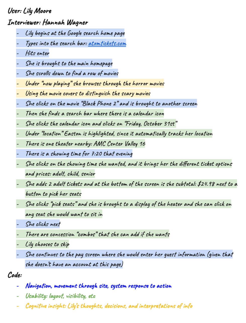
Interview notes, color coded for themes: navigation, usability, and cognitive insight
Recommendations
The first recommendation for improving the Atom Tickets website is to add a movie genre filter or browsing option on the homepage. When Lily reached the main page, she had to visually scan through rows of movie posters to identify which titles were horror or thriller movies. This process required additional time and cognitive effort, since she had to rely solely on visual cues instead of being guided by the interface. By including a clear “genre” dropdown menu or filter option, users could easily narrow their search to horror films, which would make the process much more efficient and accessible. This change would save time and reduce frustration by allowing users to focus only on relevant results.
The second recommendation is to increase the visibility and accessibility of the date-selection feature. During the usability test, Lily struggled to locate the small calendar icon when she was trying to select the correct date for the movie. Since this icon was not clearly and largely displayed, she had to scan the page carefully before noticing it. This disrupted the natural flow of the task. A more effective design would be a larger and clearly labeled “select date” button with a larger calendar icon. By improving the visibility of this feature, cognitive load would be reduced, and efficiency would increase.
Lastly, the checkout process could be much more simplified and visually guided to improve the flow of the processes. Lily had to navigate through multiple separate screens, including the seat selection, concessions, and personal information, before reaching the final payment screen. Even though each step functioned properly, the process felt very long. If the site had combined steps into a single scrollable page then it would be a much smoother experience for the user. Additionally, adding a progress bar or indicator of steps would be helpful since it provides the users with a clear understanding of where they are in the process and how many steps are remaining. This would help manage the user’s expectations and increase satisfaction by making the experience more transparent and predictable.
Limitations
The think-aloud usability interview provided important insights into Lily’s experience on the Atom Tickets website. However, this method isn’t free from limitations. A large limitation of the study is how small the sample size is, especially since this interview was conducted with only one participant. Each user brings their own unique experiences, preferences, and degree of familiarity, which provides a very limited perspective on their experience and usability. Lily’s experience may not represent how other user’s experience buying movie tickets, especially those of different ages for instance. People vary widely in levels of familiarity or accessibility needs, which make the results impossible to generalize to a larger population.
On a similar note, Lily is one of my best friends and knowing that she is being observed by me, allows her to feel more comfortable and natural with talking to me through her processes. This reflects the constraint of “Filtered statements vs. brain dump” (Nielson 2012). This issue described how participants might consciously or unconsciously filter their feedback to appear more competent or avoid seeming confused, particularly when being observed by someone they know. This could lead to less reporting of confusion or hesitation, ultimately skewing the authenticity of the final results.
To address this limitation, future studies should definitely include multiple participants with diverse backgrounds and experiences to address a wider range of behaviors. It would also be beneficial to conduct interviews with participants who do not have a personal relationship with the interviewer, to ensure a more neutral dynamic. Both of these alternatives would help the validity and generalizability of the findings.
Conclusion
Overall, this usability study revealed that the Atom Tickets websites provide a generally smooth user experience. There are a few small adjustments that could be made to the website design to make the user experience more efficient and clear. Through this think-aloud interview, it was apparent that the visual cues and intuitive navigation helped with the efficiency of the checkout process. The verbal insights helped me understand how real users think and react during their interactions with the site, which goes beyond just passive observation. Although there was a limited sample size, the study still managed to emphasize the key opportunities for improvement, such as, adding a genre filter, increasing the conspicuity of the date selector, and simplifying the multi-step purchase process. Therefore, by addressing these areas, Atom Tickets could make the user experience faster, more intuitive, and enjoyable for a wide range of audiences.


Comments